← Selected Brands
Plenty
- Industry
- Plant-Based Food · FMCG & Retail
- Year
- 2024
- Role
- Brand & Creative Design, Art Direction, Packaging Design
Brand Idea
Plenty from the Planet.
Visual Language
- Brand DNA
- Fun, natural, healthy, tasty, inviting. Ingredients up front, playful tone, light and modern visuals — because good food should feel good.
- Colour
- A clear colour system built on nutty warmth, fresh and clean blues, natural goodness greens and playful lilacs, so shoppers can navigate the range at a glance while the brand stays one voice.
- Typography
- A hand-drawn wordmark with a leaf flick paired with a bold, friendly Hebrew display face — flavour name loud, product descriptors and nutrition calm and legible.
- Imagery
- Appetite-led still life on wood boards and soft neutral surfaces, styled with almonds, cashews, crackers and fresh herbs to keep the real ingredients visible in every frame.
- Packaging System
- Three families — cups collection, vacuum collection and optional collection — each colour-coded across spread, feta, cheddar and mozzarella styles, keeping a strong, joyful identity on a crowded shelf.
- From design to shelf
- Designed for real life. From concept to production, every detail crafted for clarity, functionality and shelf impact: real ingredients, nutritional value, designed to stand out.
Applications
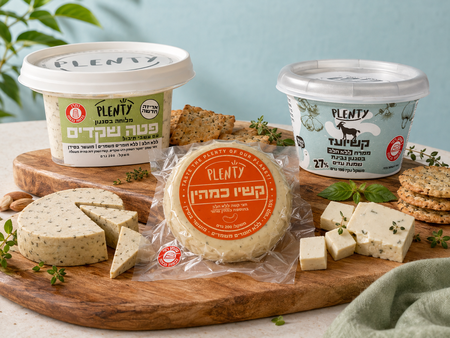
Feta style, goat-style spread and cumin hard cheese on the board
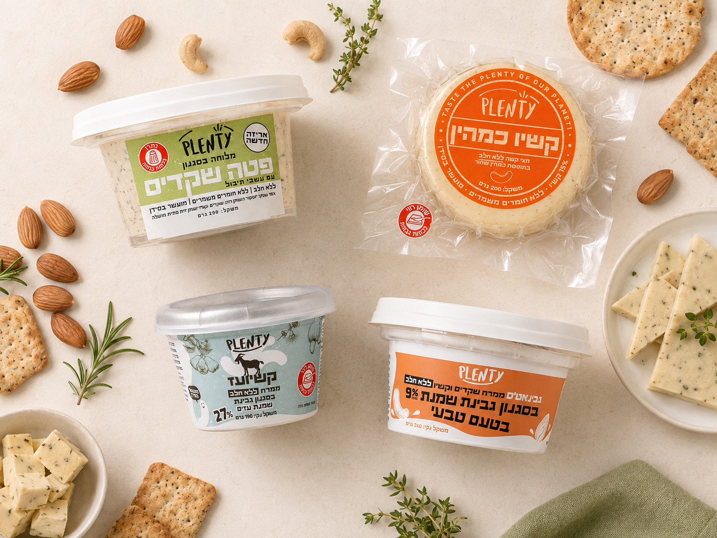
The cups and vacuum collections as one colour-coded range
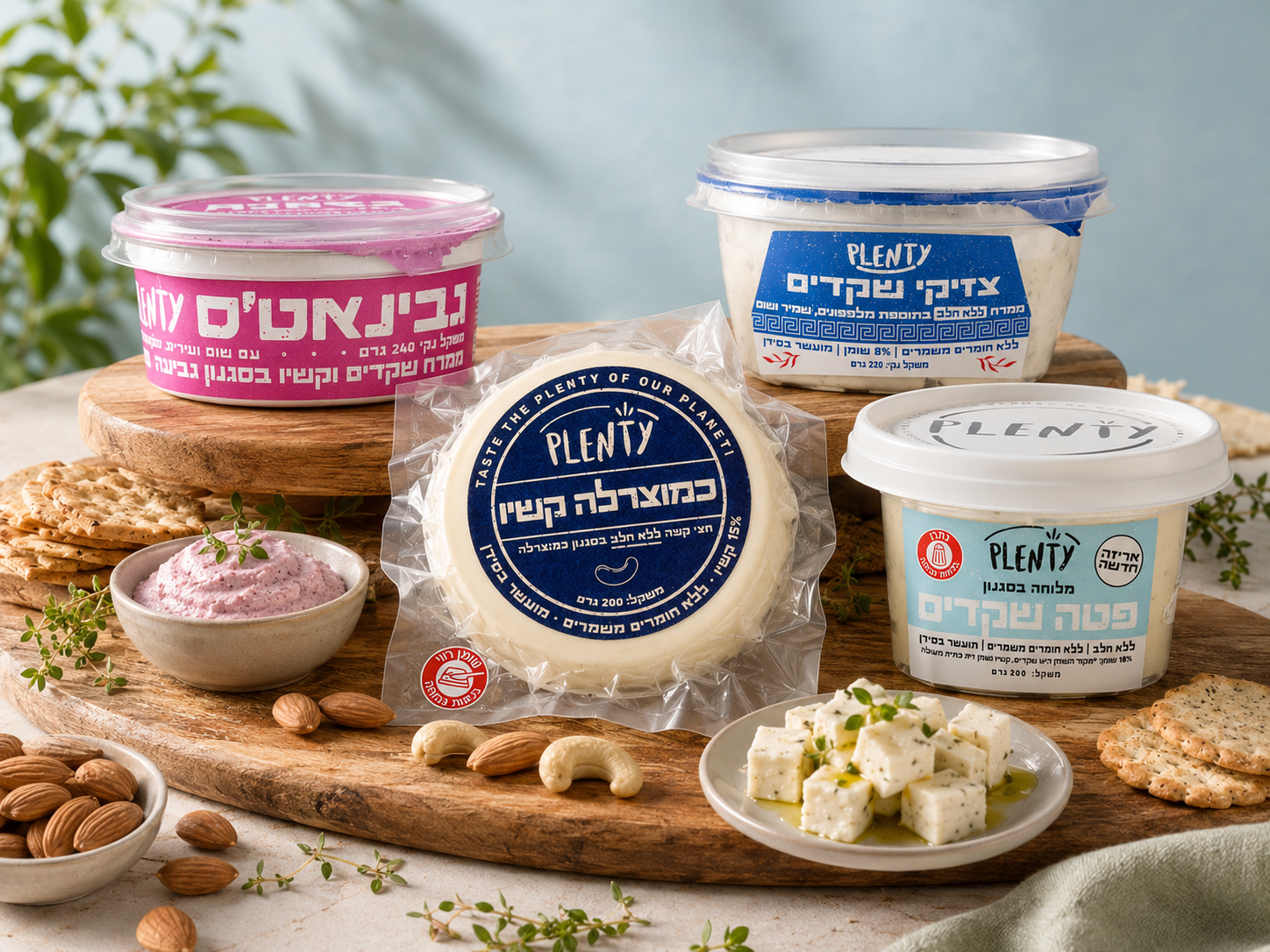
Range extension — spreads, tzatziki style and mozzarella style